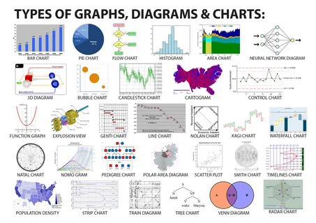
JavaScript charts provide a versatile and powerful means to achieve this, offering a range of chart types that cater to diverse use cases. This article explores seven essential chart types that every developer should master to create effective, user-friendly visualisations. By understanding the strengths and applications of these chart types, developers can enhance their ability to communicate data-driven narratives. A professional commentary from a developer is included early in the article to provide expert insight into optimising chart performance. The focus here is on practical utility, with each chart type examined for its purpose, implementation considerations, and real-world relevance, particularly for developers using JavaScript and React-based frameworks.
A developer from SciChart, a leading provider of high-performance charting solutions, offers the following advice: “When selecting a chart type for your application, prioritise performance and interactivity, especially for real-time or large datasets. Our JavaScript charting library supports over 30 chart types, allowing developers to create responsive, hardware-accelerated visualisations that scale efficiently across platforms. Always consider the end-user experience—opt for chart types that simplify data interpretation while leveraging APIs for zooming, panning, and custom interactions to enhance engagement.” This guidance underscores the importance of choosing chart types that align with both technical and user-centric requirements, a principle that informs the selection of the seven chart types discussed below.
Line Charts: Tracking Trends Over Time
Line charts are a cornerstone of data visualisation, ideal for displaying trends and changes over a continuous variable, typically time. Their simplicity makes them a go-to choice for applications such as financial dashboards, where stock prices or market trends need to be tracked, or in scientific applications monitoring sensor data. In JavaScript, libraries like Chart.js and SciChart enable developers to create smooth, animated line charts with minimal code. For instance, a line chart plotting website traffic over a month can reveal seasonal patterns or spikes in user activity, aiding strategic decision-making.
Implementing line charts requires attention to data density. With sparse datasets, a simple line chart with clear markers suffices. However, for high-frequency data, such as real-time stock feeds, developers must ensure the chart library supports efficient rendering to avoid performance bottlenecks. React developers can use libraries like Recharts to integrate line charts seamlessly, leveraging React’s virtual DOM for optimised updates. Accessibility is also crucial—ensure axes are clearly labelled, and consider colour contrasts for users with visual impairments. Line charts excel in scenarios where clarity and temporal continuity are paramount, making them indispensable for time-series analysis.
Bar Charts: Comparing Categories
Bar charts are highly effective for comparing discrete categories or groups, such as sales figures across different regions or user demographics. Their straightforward design—vertical or horizontal bars representing values—makes them intuitive for end users. JavaScript charts like those offered by ApexCharts or Highcharts allow developers to create responsive bar charts with interactive features, such as tooltips that display precise values on hover. For example, a bar chart comparing monthly sales across multiple stores can quickly highlight top performers.
When implementing bar charts, developers should consider spacing and scale. Overcrowded bars can confuse users, so limiting the number of categories or using grouped or stacked variations can improve readability. In React applications, libraries like Victory provide modular components for bar charts, allowing customisation of styles and animations. Developers must also ensure data is normalised to avoid misleading representations, such as starting the y-axis at a non-zero value, which can exaggerate differences. Bar charts are versatile, suiting both static and interactive dashboards, and their clarity makes them a staple for categorical comparisons.
Pie Charts: Visualising Proportions
Pie charts are best suited for showing proportions or percentages within a dataset, such as market share or budget allocations. Their circular format, where each slice represents a category’s contribution to the whole, is instantly recognisable. Libraries like Chart.js simplify the creation of pie charts, with options for custom colours and animations to enhance visual appeal. For instance, a pie chart displaying the distribution of a company’s revenue sources can quickly communicate the dominance of a particular stream.
However, pie charts have limitations. They become cluttered with too many categories, so developers should limit slices to five or six for clarity. Interactivity, such as clickable slices or tooltips, can mitigate this by providing additional context. In React, Nivo’s pie chart component offers responsive design and theming, making it ideal for modern web applications. Developers should avoid overusing pie charts for complex datasets, as they can obscure subtle differences between similar values. When used judiciously, pie charts effectively convey proportional relationships to a broad audience.
Scatter Charts: Revealing Relationships
Scatter charts are powerful for visualising relationships between two variables, often used in scientific, financial, or analytical applications. Each point on the chart represents a data point’s values for two axes, making it ideal for identifying correlations or clusters. JavaScript charting libraries like Plotly.js or SciChart excel at rendering scatter charts, especially for large datasets, with features like zoom and pan to explore dense plots. For example, a scatter chart plotting customer age against purchase amount can reveal spending patterns.
Implementing scatter charts requires careful consideration of data scale and distribution. Logarithmic scales may be necessary for skewed datasets to prevent points from clustering excessively. Developers should also incorporate tooltips to display exact values, as points alone can be hard to interpret. In React, libraries like Recharts provide scatter chart components that integrate with state management for dynamic updates. Accessibility considerations include using distinct markers or colours for differentiation. Scatter charts are essential for exploratory data analysis, offering insights into relationships that other chart types cannot easily convey.
Area Charts: Highlighting Cumulative Trends
Area charts, a variation of line charts, are effective for showing cumulative data or stacked trends over time. They fill the area beneath the line, providing a visual sense of volume or magnitude, such as total revenue over a year broken down by product categories. Libraries like Syncfusion and SciChart support area charts with options for stacking and transparency, enhancing their utility for layered datasets. For instance, an area chart showing website traffic sources over time can highlight the growing dominance of mobile users.
When creating area charts, developers must ensure the data is additive for stacked configurations to avoid misinterpretation. Transparency settings can prevent overlapping areas from obscuring data. In React, Victory’s area chart components allow for smooth integration and customisation, supporting animations that enhance user engagement. Developers should also consider mobile responsiveness, as area charts can become cluttered on smaller screens. By emphasising cumulative trends, area charts provide a visually compelling way to present layered time-series data.
Heatmaps: Visualising Intensity and Density
Heatmaps are specialised charts that use colour gradients to represent data intensity or density across two dimensions, commonly used in fields like finance, healthcare, and user behaviour analysis. For example, a heatmap showing website click activity can reveal high-engagement areas. JavaScript charts like those in D3.js or SciChart are well-suited for heatmaps, offering high-performance rendering for large datasets. Their WebGL-based rendering ensures smooth visuals even with complex data.
Implementing heatmaps requires careful selection of colour schemes to ensure accessibility, avoiding combinations like red-green that may be problematic for colourblind users. Developers should also provide tooltips or legends to clarify values, as colour alone can be ambiguous. In React, Nivo’s heatmap component simplifies integration, with built-in responsiveness for cross-device compatibility. Heatmaps are particularly valuable for identifying patterns in dense datasets, making them a critical tool for developers working on analytical dashboards.
Candlestick Charts: Financial Market Analysis
Candlestick charts are a staple in financial applications, used to visualise price movements of assets like stocks or cryptocurrencies over time. Each candlestick represents open, high, low, and close prices, providing a compact view of market activity. Libraries like SciChart and ApexCharts offer robust candlestick chart implementations, with features like zoom and real-time updates for dynamic trading platforms. For example, a candlestick chart tracking a stock’s daily performance can help traders identify trends or reversals.
Implementing candlestick charts demands attention to performance, as financial datasets can be voluminous. Developers should leverage libraries with hardware acceleration to handle real-time updates efficiently. Interactivity, such as zooming or crosshair cursors, enhances usability for traders. In React, libraries like Recharts can be adapted for candlestick charts, though custom components may be needed for advanced features. Candlestick charts are essential for financial applications, offering a detailed yet accessible view of market dynamics.
Choosing the Right Chart for Your Project
Selecting the appropriate chart type depends on the data’s nature, the audience, and the application’s goals. Line and area charts suit time-series data, while bar and pie charts excel at categorical comparisons. Scatter charts and heatmaps are ideal for relational or density-based insights, and candlestick charts are tailored for financial contexts. Developers must also consider the technical constraints of their chosen JavaScript charting library, ensuring compatibility with their tech stack, such as React, and evaluating performance for large datasets.
For React developers, libraries like Victory, Nivo, and Recharts offer seamless integration, with components designed for modularity and reuse. Performance is a critical factor—libraries like SciChart, with its WebGL-based rendering, are optimised for big data and real-time applications, while Chart.js is better suited for simpler, static visualisations. Accessibility and responsiveness are non-negotiable, ensuring charts are usable across devices and for all users. By mastering these seven chart types, developers can build intuitive, high-performance visualisations that meet diverse project needs.
Practical Implementation Tips
When integrating JavaScript charts into a project, start by defining the data structure and desired user interactions. Use TypeScript for type safety, especially in complex React applications, to catch errors early. Libraries like SciChart provide extensive TypeScript support, streamlining development. Ensure charts are responsive by testing across devices, and use CSS media queries or library-specific responsive features to adapt layouts. For interactivity, implement tooltips, zooming, and panning to enhance user engagement, but avoid overloading the interface with excessive features.
Testing is critical—validate chart performance with large datasets to ensure smooth rendering. Tools like Lighthouse can assess accessibility, ensuring compliance with standards like WCAG. For React projects, leverage hooks like useEffect to manage chart updates efficiently, minimising re-renders. Finally, document your code thoroughly, especially when using complex libraries like D3.js, to facilitate maintenance and collaboration.
Future Trends in JavaScript Charting
The landscape of JavaScript charting is evolving, driven by demands for real-time, big-data visualisations. Libraries are increasingly adopting WebAssembly and WebGL for enhanced performance, enabling charts to handle millions of data points. AI-driven visualisations are also emerging, with libraries integrating machine learning to suggest optimal chart types based on data patterns. For React developers, the focus is on lightweight, modular components that integrate seamlessly with modern frameworks like Next.js.
Sustainability is another consideration, with libraries optimising for resource efficiency to reduce hardware costs in mobile or embedded applications. Community-driven development, as seen in open-source libraries like Chart.js, continues to thrive, offering free alternatives with robust ecosystems. However, for enterprise-grade applications, paid libraries provide unmatched support and performance, making them a worthwhile investment for complex projects.
Conclusion
Mastering these seven chart types—line, bar, pie, scatter, area, heatmap, and candlestick—equips developers with the tools to create compelling, user-focused data visualisations. By leveraging JavaScript charts and React-compatible libraries, developers can build responsive, high-performance dashboards that cater to diverse industries, from finance to healthcare.


